
Quality Matters Standard 8 focuses on Accessibility and Usability in course design. If a recent course review has identified inaccessible aspects of your course, use the checklist below to begin your remediation.
Accessibility in online learning means that all populations of students, regardless of disability, are able to perceive, understand, navigate, and interact with their course materials and can contribute to the course without barriers. Courses and course content that are designed accessibly anticipate barriers and proactively remove them for all students in a course.
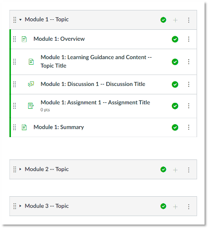
Specific Review Standard 8.1 asks that course navigation “facilitate ease of use.” A consistent look and feel across all courses in a program and across all learning management system pages within a course can help maintain consistency. It can also help students to navigate where they need to go easily.
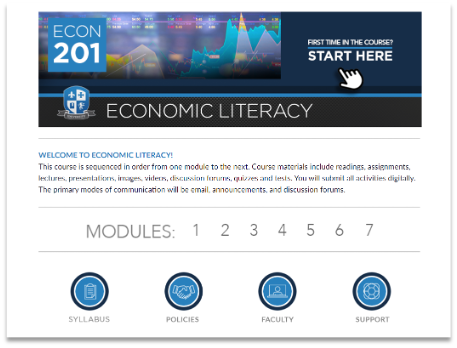
Make sure that your course is organized in a way that is “consistent, logical, and efficient.” The Risepoint provided course template helps guarantee that a “consistent layout and design are employed throughout a course, making content, instructional materials, tools, and media easy to locate for students.” The Learning Design team with Risepoint designed the template to use “design elements that are used repetitively, increasing predictability and intuitiveness.”
To facilitate ease of use for Specific Review Standard 8.1, provide your students with self-describing hyperlinks. This means that all links, files, and icons are all labeled with meaningful names that describe where they will take the user. This is important because students who utilize screen readers navigate through pages and documents link-by-link. If a student using a screen reader lands on a hyperlink, the screen reader will read the full text of the hyperlink (with all the numbers, hyphens, and letters too).
Incorrect hyperlink text
Avoid pasting long, complicated URLs into pages and documents.
Avoid using “click here” as a link text. A screen reader can’t tell the difference between multiple “click here” links.
- Click Here to see the website.
Avoid asking students to copy and paste a link into a browser.
- Copy and paste this link into your browser: https://www.risepoint.com/about/
Correct hyperlink text
Use hyperlink text that describes the destination of the link.
- Visit the Risepoint About Us webpage to learn more.
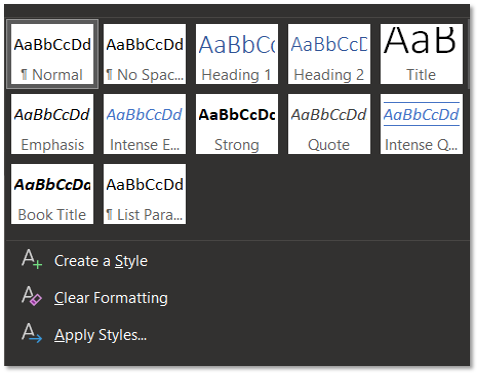
Standard 8.2 asks reviewers to check that a course design “facilitates readability.” This includes looking for Heading Styles. Heading styles in documents and webpages indicate the hierarchy of material and are used to organize information quickly.
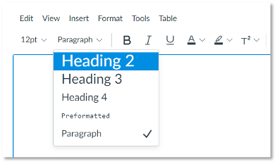
Headers allow screen reader users to navigate through pages and documents using a digital table of contents. Heading styles apply visual content breaks to both the text for visual users but also within the metadata of a document or page, so that users navigating the content with a screen reader can easily tell where they are located.
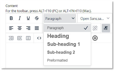
Instead of changing the font of a header manually using “bold” or a different font type, use the heading styles pane located in all Microsoft products or in your institution’s LMS like Canvas, Blackboard, or D2L Brightspace. Styles will create a visual identifier and a hierarchy identifier for screen reader users. To do this, simply highlight or click on the text that you want to make a header and select the header pane option.
Specific Review Standard 8.2 asks that course design “facilitates readability.” Limiting the use of color assists learners that have colorblindness or low-contrast sensitivity. In general, text color should be a contrasting color that is distinguishable from the background. This includes all text in your courses including in images, maps, icons, buttons, PowerPoints, textbooks, and more.
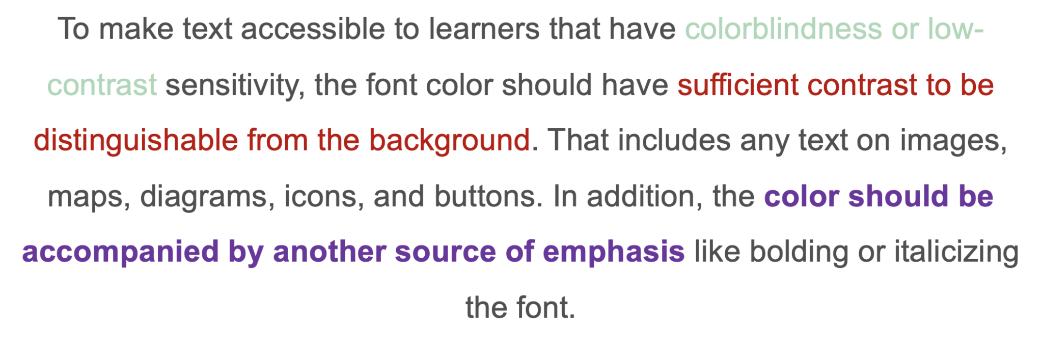
If you use color to emphasize content in your courses, you will also want to accompany that color with another source of text emphasis like bold or italics. That way, a student who is colorblind or a student who prints out a document on a black and white printer can easily understand the emphasized text by an alternative means.
Another way to review for readability is to consider “white space” or “negative space.” White space and negative space can and should be used around your content to help increase comprehension. Large blocks of text or the use of lots of decorative images can cause eye fatigue, and when making style decisions, simplicity is a great rule of thumb. Only include extra stylized items if they help learners accomplish particular objectives in your course. If you are adding extra text or images for the sake of filling up space, the accessible recommendation is to remove it.
When it comes to readability, font style and size should also be noted, a consideration of Specific Review Standard 8.3. An easy way to support readability is to use the font style and size that is automatically provided by your LMS, which adheres to WCAG standards.
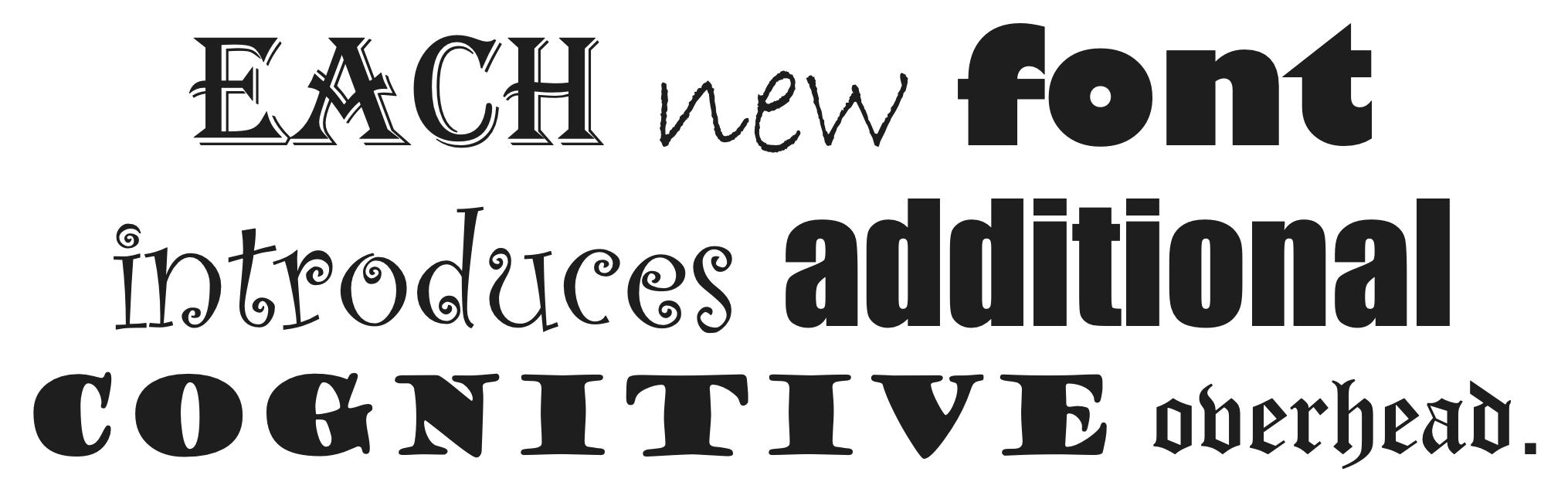
If you are creating documents for your course, simplicity in typeface is critical. Use a familiar font that is common and standard across different systems (Arial, Times New Roman, Calibri, etc.). But most importantly, avoid font mixing. Limit the font families in your documents to one or two styles. The more font styles and sizes used introduces additional cognitive overhead for your students.
Tables are a great way to organize information for students, but they can pose accessibility challenges. Specific Review Standard 8.3, which looks for the accessibility of text, asks reviewers to check tables for clear navigation.
A first step to creating accessible tables and avoiding errors is that tables should always be provided as text and not as images. When building a table in a document or LMS, you will also want to provide a header row for columns and a header for rows if applicable. From there, keep your tables as simple as possible. Common accessibility errors include things like merged cells, empty cells, or split cells. These pose issues for users as it may be difficult or impossible to navigate to all cells in a table using keyboard functionality.
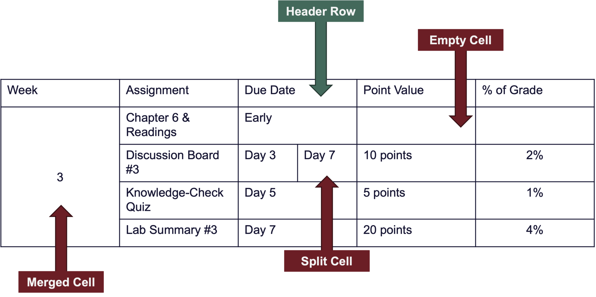
Most importantly, it’s important that the tables in your course summarize data, and not be used for style/formatting. Tables used for style and formatting can be very difficult to navigate and very frequently pose accessibility challenges. If you use tables for formatting certain pages in your LMS, discuss alternative HTML options with your on-campus instructional design teams.
To increase ease of use and comprehension, Specific Review Standard 8.4 requires images in pages, documents, and presentations to be accessible. Alternative text (also called alt-tags) can be added through your Microsoft software or in the content creation pages in your LMS like Canvas, Blackboard, and D2L Brightspace. Alternative text asks you to describe what is happening in an image and should be clear and concise. As a general rule, you’ll want to shoot for about 125 characters in order to describe your image.

When determining appropriate alt-text, context is everything. Alt text for one image may be vastly different based on the context and surroundings of the image. As the SME, you determine the best alt text based on context. For example, consider how you might share a picture of a puppy in three different contexts. If you were sharing the image on your “Meet the Instructor” page in your online course, your alt text might read “my puppy, Millie, sitting in the grass.” However, the alt text for the same image would be totally different on a dog training website or on a leash and harness website.

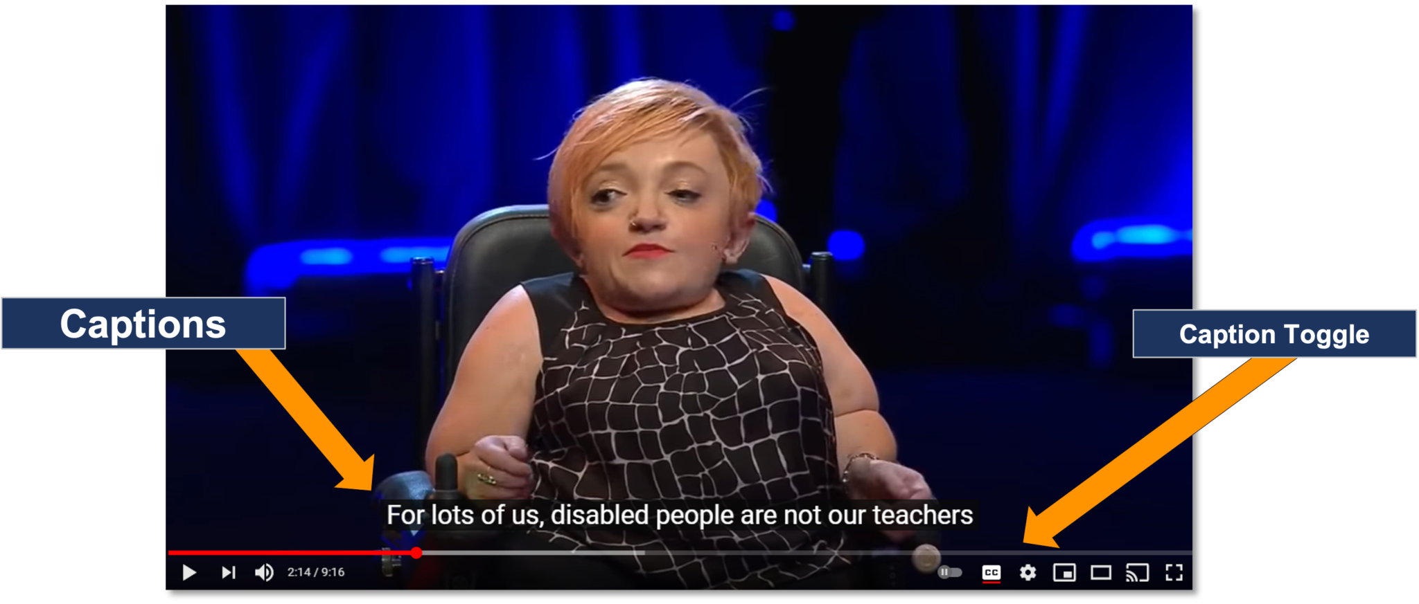
Specific Review Standard 8.5 checks that for video and other media content is accessible. Any videos or animations in the course should be captioned. Most lecture platforms (including YouTube) have an option to enable auto-captions. Auto-captions will often meet standard for accessibility within Quality Matters, but for true accessibility, editing is almost always required.
The rule for captioning is that captions should provide “an equivalent experience for all users,” so it’s important to check that captions have been edited where necessary.
If you are using a video that does not belong to you that also does not have captions, check out Amara. Amara is a free-to-use resource that houses millions of captioning files for non-captioned videos across the web. It also has a captioning tool that makes it easy to caption video content you do not own. They provide captions in many languages and in many formats. You could also consider contacting the original owner of the video and ask them to turn on auto-captions or provide edited captions.
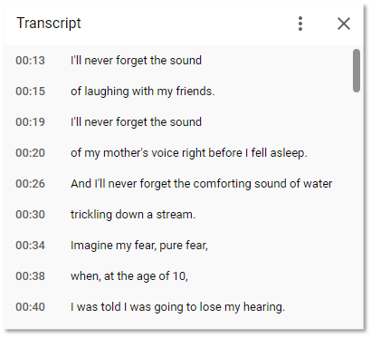
If you use audio-only content like podcasts or music in your course or if you use voice-over PowerPoints, you’ll want to provide a text transcript, which you can provide in a variety of file types. If you use podcasts, you can often find the text transcript of that podcast provided on the original hosting website. It might take some digging, but this is becoming a more regular practice in the podcasting world.
Resources
Major Learning Management Systems have built-in accessibility checkers that allow you to check the accessibility of your page content. A few examples are the Canvas Accessibility Checker, the Blackboard Checker in the Rich Content Editor, and the Brightspace D2L Checker. Your institution may also work with the embedded accessibility tools Blackboard Ally or UDOIT, which make it easy to run reports on the accessibility of your content.