
Images and visuals can transform the way students understand your course materials. Whether illustrating a complex idea, visualizing data, or creating a relatable story moment, AI tools can help faculty quickly generate teaching-ready media.
Whether you’re designing scenes that support storytelling or data-driven graphics like charts and infographics, this guide provides AI prompt templates and examples for creating purposeful, accurate, and consistent visuals.
Characteristics of Strong Instructional Images
Effective instructional visuals share several qualities. They should be:
- Purposeful: Every image should support understanding (clarifying a process, visualizing data, or showing context for a concept).
- Accurate: Data visuals and diagrams must reflect real proportions, relationships, or labels to avoid confusion.
- Consistent: Use similar color palettes, styles, and lighting across images to create visual cohesion throughout a course.
- Accessible: Prioritize clear contrast, legible labels, and simple compositions that communicate at a glance.
- Engaging: Images that show human activity, story-driven moments, or relatable settings increase student interest and recall.
Storytelling Images with AI
Use storytelling visuals when you want to show people, scenes, or settings that help students connect abstract ideas to real-world context. These are most effective for case studies, process examples, and scenario-based learning.
Start by describing what’s happening and why it matters.
- What key action or behavior should students notice?
- Who or what is involved (number of people, role, setting)?
- What tone fits the moment (calm, focused, collaborative, urgent)?
Example: “An illustration showing a nursing instructor guiding two students during a simulated patient assessment. Focus on teamwork and hands-on learning.”
If you’ll create multiple related scenes, establish constants that maintain coherence:
- Same main characters and environment
- Consistent lighting and wardrobe cues
- Shared palette and illustration style
Prompt Tip: Add “in the same visual style and lighting as the previous image” to help the AI maintain visual continuity across a sequence.
AI responds best to short, ordered direction. Tell it how to frame the story.
- Style: realistic photo, semi-realistic illustration, vector, cinematic still, or flat academic graphic
- Framing: wide shot (context), medium (interaction), close-up (emotion)
- Color tone: neutral academic, warm human-centered, or cool technical
AI tools respond best when they have visual context. If you already have an image that captures the style, composition, or characters you want, upload or link it as a reference.
Using a reference image helps the model:
- Maintain consistent character appearance, environment, and palette across scenes.
- Match your institution’s or course’s visual identity.
- Reduce randomness in lighting, perspective, and proportions.
Example Addition: “[Prompt…] Reference Image: [insert link or upload previous scene]. Keep characters and setting consistent with the reference.”
Expert Tip: Even a rough sketch or previous AI-generated frame can serve as a strong reference. Each iteration helps “teach” the model your desired look, yielding steadier results than starting from scratch.
Use the following template and fill in your personal details and touches:
Create an [illustration/photo] showing [main subjects] [performing key action] in [setting]. Capture [emotion or teaching focus]. Use [style] with [lighting/color tone]. Keep the layout clear and consistent with [previous image or course theme]. The image should help students visualize [specific concept or skill].
Example: “Create a semi-realistic illustration showing two nursing students documenting patient vitals in an electronic chart while a clinical instructor observes. Capture focus and collaboration. Use bright, professional lighting with calm blue and gray tones. The image should help students visualize effective teamwork in clinical documentation.”

Data-Driven Visuals with AI
From quick comparisons to process diagrams, use AI to draft clear, teaching-ready visualizations that make data stories easy to grasp. AI tools are best for structure and layout, not numeric precision, so focus on what the chart should communicate, not the exact data points.
Strong data-driven visuals should have:
- A clear teaching purpose
- Simple composition (max 4–5 variables)
- Logical labeling and hierarchy
- Accessible colors and contrast
- Accurate proportions, even if approximate
Decide what learning moment the chart should reveal. Ask yourself:
- Is this about a comparison, trend, or relationship?
- What categories or timeframes should appear?
- What is the single insight students should take away?
Tip: Frame your description as “what you want learners to notice,” not “everything you have.” The clearer your focus, the cleaner your visual.
AI struggles with dense or overly detailed data. Keep prompts visually simple and ordered.
- Begin with chart type and purpose.
- Specify only 3–5 categories or data points.
- Use a neutral color palette (muted blues, grays, or your institution’s colors).
- Request clear axis labels and proportional accuracy.
- Avoid text-heavy legends or numerical precision.
Before using an AI-generated chart in class or publication, confirm it communicates truthfully.
- Axes and category labels are correct and legible.
- Bar or line proportions align with your intended relationships.
- Colors clearly differentiate categories.
- No fabricated or misleading data appears.
- The message matches your learning objective.
Tip: Treat AI-generated visuals as mockups. Once the layout looks right, recreate the chart in Excel, Power BI, Canva, or Figma to ensure data integrity.
Use the following template and fill in your personal details and touches:
Create a [chart/diagram/infographic] that shows [main relationship or comparison] with [2–5 categories]. Focus on [visual goal – clarity, trend, or proportion]. Use [style and color tone]. Include clear axis labels and a concise title: [insert title]. The image should help students visualize [specific concept or skill].
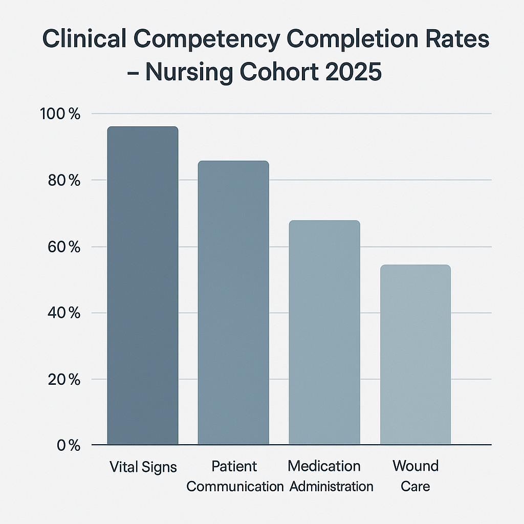
Example: “Create a line chart showing improvements in patient safety outcomes before and after simulation-based training in a nursing program. Use minimalist design with white background, thin blue line, and clear axis labels. Title it ‘Impact of Simulation Training on Patient Safety.’ The image should help students visualize cause-and-effect relationships.”
If you’ve already generated a good chart or found one with the right composition, upload or link it as a reference image. AI models can mimic its structure and style, ensuring future visuals stay visually aligned with your course.
Prompt Addition: “Use the previous chart as a reference for layout, colors, and proportions.”
Understanding AI’s Limits With Text and Data
AI image generators are remarkably strong at visual storytelling like showing people, places, and scenarios with convincing realism or style. But they’re far less consistent when asked to communicate precise information such as numbers, labels, or small text.
Why It Happens
Generative models interpret prompts as visual patterns, not as logical data structures.
They can infer “what a chart looks like,” but not how to plot values accurately. When too much information is packed into a single prompt (labels, percentages, icons, multiple text fields) the model “averages” details, producing blurry text, mismatched numbers, or distorted proportions.
Strong AI Use Cases
- Character and scenario images: AI creates images that are consistent and expressive
- Conceptual diagrams: AI can show relationships or processes without heavy text
- Style guides and mockups: AI offers you ideas for composition and color planning
Weak AI Use Cases
- Infographics with dense data: Text in AI images is often illegible or misplaced
- Labeled charts or maps: AI names or categories are frequently wrong or repeated
- Multi-panel comparisons: Layout symmetry breaks unpredictably
How to Work Around It
Struggling with AI and images? Try these quick workarounds to stretch the limits!
- Generate structure first, data second. Use AI to design the layout or visual concept, then rebuild it in a structured tool like PowerPoint, Canva, or Excel.
- Use short labels or icons instead of full text. Replace “Student Engagement by Modality (2020-2024)” with “Engagement Trend.”
- Provide clear composition cues. Use phrases like “four evenly spaced bars,” “horizontal layout,” or “legend below chart” improve results.
- Avoid text in image when possible. Add annotations later using your design tool for clarity and accessibility.